Power BI Financial Reporting and Dashboards: The Complete Guide for CFOs and Finance Teams
by Kevin Wiegand
|Updated 2 Jul 2026
|Power BI
Spending hours each month wrestling with spreadsheets and manual data exports? Many finance teams across Australia, the UK and New Zealand face the same challenge: turning raw accounting data into reports and dashboards that actually drive decisions. Power BI financial reporting automates refresh and turns that data into financial statements and dashboards that update as your numbers change. This guide covers both sides of the job: the reporting layer that produces your P&L, Balance Sheet, Cash Flow and Trial Balance, and the dashboards CFOs and Financial Controllers use to read them, including the KPIs behind each one, worked examples and templates, and a practical path to multi-entity consolidation.
What Is Power BI Financial Reporting?
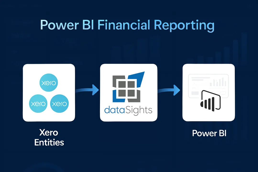
Power BI financial reporting connects your accounting data to interactive reports and dashboards that update automatically. Finance teams use it to build consolidated P&L statements, balance sheets and KPI dashboards across multiple entities, removing manual CSV exports and spreadsheet consolidation. With automated Xero connections through dataSights, teams can materially shorten close cycles while improving visibility into group performance.
What Is a Power BI Financial Dashboard?
A Power BI financial dashboard is a single-page canvas in the Power BI Service that pins tiles from underlying reports to visualise financial KPIs, variance analysis, and consolidated financial statements. In everyday finance use, "dashboard" is also used loosely to describe multi-page Power BI reports built in Power BI Desktop, and this guide covers both. According to the 2025 Gartner AI in Finance Survey, 59% of finance leaders now use AI inside the finance function. Separately, Gartner's August 2025 CFO survey found that 56% of CFOs rank cost optimisation and 51% rank improving forecast accuracy in their top five priorities heading into 2026.
Table of Contents
Why Finance Teams Choose Power BI for Financial Reporting
Traditional financial reporting relies heavily on Excel. Spreadsheets remain useful for ad-hoc analysis, but they struggle with large datasets and repeatable refresh. Power BI replaces the monthly cycle of manual assembly with governed reports and dashboards that update automatically, cutting the time between a transaction posting and a director seeing its impact.
The value is operational. Power BI gives finance teams a governed reporting layer with drill-through, scheduled refresh, and reusable semantic models. Teams that move reporting into Power BI typically see:
- Governed definitions that produce one version of revenue, margin, and cash across every chart
- Interactive drill-through from consolidated totals down to transaction-level detail
- Configured refresh schedules that remove manual CSV exports from the close cycle
- Self-service access for business-unit leaders, so finance stops being an order-taker for ad hoc reports
Management Reports in dataSights deliver the board-ready P&L, Balance Sheet, Cash Flow, Trial Balance, and KPI views that CFOs send to directors each month. For teams that want flexible spreadsheet analysis, Excel automation sits on the same reporting layer through the Office Add-In and Power Query. For teams that need custom visualisation and drill-down, Power BI adds interactive dashboards on top of those same figures. Teams that want to query the consolidated data in plain English can also use AI Connect from Claude, ChatGPT or Copilot. Each approach reads from one source, rather than one replacing the other.
Ready to Automate Your Financial Consolidation?
Stop wrestling with manual consolidations and broken formulas. dataSights automates multi-entity reporting, Xero consolidations, and Power BI connections. Join over 250 businesses already transforming their financial reporting with our platform, rated 5.0 out of 5 by 89 verified Xero users.
Start Your Free 14-Day TrialEssential KPIs for CFO Dashboards
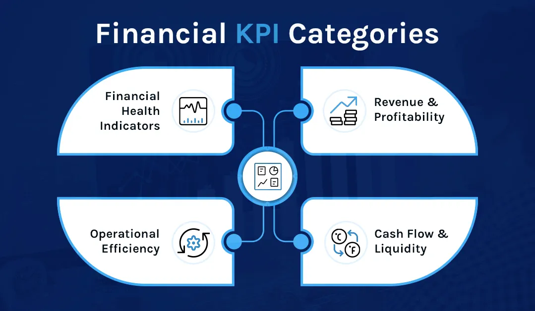
A finance dashboard is only as useful as the metrics behind it. The KPIs below are the ones Financial Controllers and CFOs track most consistently, grouped into four categories so you can build out a dashboard without overloading a single page. In dataSights, these KPIs should first reconcile through Management Reports and Trial Balance outputs, then surface in Excel or Power BI, depending on how the team wants to analyse them.
Revenue and Profitability Metrics
- Revenue growth rate by period, segment, and entity
- Gross margin and net margin, with variance to budget and prior year
- Revenue by product, service line, or customer cohort
- Customer acquisition cost against customer lifetime value
Cash Flow and Liquidity
- Daily and projected cash position across bank accounts
- Cash conversion cycle
- Accounts receivable and accounts payable ageing
- Working capital and its month-on-month movement
Operational Efficiency and Budget Variance
- Operating expense ratio
- Budget versus actual variance by department and cost centre, with material deviations flagged automatically
- Days sales outstanding and days payable outstanding
- Return on capital deployed
Financial Health Indicators
- Current ratio, quick ratio, and cash ratio
- Debt-to-equity ratio
- EBITDA and EBITDA margin trend
- Net income by entity with group consolidation
- Return on investment, return on equity, and return on assets
Power BI Financial Dashboard Examples and Templates
The six dashboards below cover the most common finance use cases. Each one answers a specific set of questions, so resist the urge to combine them onto one canvas. Together they capture the views finance teams search for most: executive summaries, cash flow, consolidation, budget variance, balance sheet, and predictive analytics.
1. Executive Summary Dashboard
The executive view brings revenue, margin, cash position, and variance into a single snapshot for board and leadership review. Use scorecards for headline metrics with colour-coded variance indicators, line charts for revenue and profitability trends across 6 to 12 months, and a waterfall chart to bridge budget to actual. Geographic heat maps help when operations span regions.
2. Cash Flow Management Dashboard
A cash flow dashboard focuses on liquidity and working capital. Show current cash position across accounts, 30, 60, and 90 day projections, receivables and payables ageing, and the cash conversion cycle. Combine operating, investing, and financing activities on a single page so directors can see where cash is coming from and where it is going.
3. Multi-Entity Consolidation Dashboard
Groups with multiple Xero entities face the heaviest reporting burden each month. A consolidation dashboard shows a group P&L and Balance Sheet with inter-company eliminations applied, entity-level drill-down, and variance by entity. Multi-currency groups need exchange rate handling aligned with IAS 21, which means average rates for the P&L, closing rates for the Balance Sheet, historical rates for equity items, and a foreign currency translation reserve in OCI.
For teams consolidating Xero data, the dataSights Xero consolidation solution delivers the underlying consolidated Management Reports first, with Power BI dashboards layered on top. That ordering matters: the board receives the management pack; the dashboard supports the conversation around it.
4. Budget vs Actual Variance Dashboard
Variance analysis is where Power BI earns its keep. Show absolute and percentage variance side by side, apply conditional formatting to flag material deviations, and use a waterfall chart to decompose the movement from plan to actual. Department and cost-centre slicers let owners inspect their own numbers without a finance analyst intervening.
5. Balance Sheet Dashboard
A balance sheet dashboard surfaces liquidity ratios, working capital composition, and the month-on-month movement in receivables, inventory, payables, and debt. Microsoft's star schema guidance for Power BI covers the data model this dashboard needs: a shared Date dimension, a Chart of Accounts dimension, and separate fact tables for actuals, budgets, and forecasts so DAX time intelligence behaves correctly.
6. Predictive Analytics Dashboard
Power BI's built-in key influencers and anomaly detection visuals turn historical data into forward-looking insight. A predictive dashboard flags revenue or expense outliers against an expected range, shows a forecast with confidence bands, and ranks the drivers most likely to be behind a deviation. This moves finance from explaining last month to flagging next month.
Ready-Made Dashboard Templates
Building each dashboard from a blank canvas is optional. dataSights provides a ready-made Power BI consolidation template that connects to your dedicated Xero database, so the data model, eliminations and core measures already exist. The video below walks through the end-to-end process: downloading the template, connecting it to your Xero database, publishing to the Power BI Service, and configuring scheduled refresh so dashboards stay current without manual exports.
Setting Up Power BI for Financial Reporting
Getting started with Power BI financial reporting involves three stages: connecting your data sources, building your data model, and creating reports. Keep the scope tight for the first build: one audience, one decision, one refresh cadence.
Connecting to Accounting Data
Power BI Desktop connects directly to many accounting platforms. For Xero users, the simplest approach uses CSV exports, but this requires manual updates and loses the automation benefit. A better solution connects Xero data through an automated pipeline to a SQL database, which Power BI then queries directly. dataSights automates this connection for Xero users, syncing data to a dedicated Azure SQL database that Power BI refreshes automatically. The same consolidated dataset can feed both board-ready management packs in dataSights and Power BI dashboards, so teams do not maintain two reporting truths.
Building the Data Model
Financial reporting in Power BI requires thoughtful data modelling. You need to define relationships between tables: linking transactions to accounts, accounts to reporting categories, and entities to the group structure. A star schema, or a lightly snowflaked variant where it is justified, usually works best for financial data. Start with a central fact table for transactions, balances, or trial balance, and relate it to dimension tables for time periods, accounts and entities. Use separate fact tables for actuals, budgets and forecasts so time intelligence behaves correctly.
Creating DAX Measures
DAX (Data Analysis Expressions) powers the calculations in Power BI. You create measures for account subtotals, period comparisons, variances and ratios. Core measures include Total Revenue, year-on-year growth, gross margin percentage, and time-intelligence variants like SAMEPERIODLASTYEAR and TOTALYTD. Financial statements require careful DAX work: income statements need subtotals at multiple levels, balance sheets must balance, and cash flow statements require specific categorisation logic. Keeping the Date dimension correct is the single biggest factor in whether DAX time intelligence behaves.
Designing Reports
Report design should prioritise clarity over complexity.
- Place summary KPIs at the top of pages, with supporting detail below.
- Use consistent colour coding, such as green for favourable variances and red for concerns.
- Include filters for time periods, entities and departments so users can slice data without opening separate reports.
- Also use labels, icons or conditional formatting rules with text, so meaning does not rely on colour alone.
Creating Standard Financial Reports in Power BI
Power BI can replicate traditional financial statements while adding interactive capabilities.
Profit and Loss Statement
Build your P&L using a matrix visual with account categories in rows and time periods in columns. DAX measures calculate subtotals for revenue, cost of goods sold, gross profit, operating expenses and net profit. Include variance columns comparing the budget and prior periods.
Balance Sheet
The balance sheet requires careful attention to ensure assets equal liabilities plus equity. Use a similar matrix structure with account groupings. Consider adding drill-through pages that show the transactions behind each balance for audit purposes.
Cash Flow Statement
The cash flow statement presents greater complexity, as it requires categorising movements into operating, investing and financing activities. Some items need special treatment: depreciation adds back to operating cash flow despite reducing profit, for example.
Trial Balance
For finance teams, the trial balance remains essential. A consolidated Trial Balance across all entities provides the reconciliation checkpoint before finalising any reports. dataSights delivers pre-formatted management packs through its web platform, including a Consolidated Trial Balance, P&L, Balance Sheet and Variance Analysis. Trial Balance forms the foundation for accurate consolidation, and all adjustments must reconcile back to it.
Connecting Xero to Power BI
Xero users have specific considerations when building Power BI financial reports.
Native Limitations
Xero provides basic reporting within the platform, but lacks true management report functionality for multi-entity groups. The Xero API offers access to transaction data, though extracting comprehensive reports requires significant development effort.
Integration Approaches
Several methods connect Xero data to Power BI:
- Manual CSV export: Works for occasional analysis but requires repeated effort and loses automation benefits.
- Third-party middleware: Automates the data pipeline. dataSights syncs Xero data via API to a dedicated SQL database, handling authentication, rate limits and data transformation automatically. Power BI connects to the database using standard connectors with scheduled refresh.
- Custom API integration: Possible, but requires development resources and ongoing maintenance as APIs evolve.
What Gets Synchronised
A comprehensive Xero to Power BI connection should include trial balance data, transaction details, invoices, bills, contacts, bank transactions, journals and budget figures. Trial Balance forms the foundation, and all adjustments should reconcile back to it.
Power BI vs Excel for Financial Reporting: Which Fits Where?
Power BI does not replace Excel for finance teams. For dataSights users, Excel keeps its role for custom reports, month-end tasks, reconciliations, and cashflow models, while automated refresh through the Office Add-In and Power Query removes the CSV handling that usually slows those workflows down. The two tools fit different parts of the close.
Excel remains the best environment for ad hoc modelling, scenario work, reconciliations, and the detailed journals that controllers own. Power BI is stronger for governed dashboards, multi-entity consolidation, and self-service access across the wider business. Most finance teams use both, and the majority of dataSights customers who automate Excel still use Power BI for group dashboards. The dataSights Power Query connector handles the refresh into Excel; the dataSights Xero to Power BI connector handles the refresh into Power BI. Both pull from the same dedicated per-customer Azure SQL database, so the numbers reconcile.
Multi-Entity Consolidation in Power BI
For groups with multiple legal entities, consolidation represents the biggest challenge and the greatest opportunity for automation. Each entity keeps its own chart of accounts, inter-company transactions need elimination, and foreign subsidiaries bring currency translation into the picture. Doing this in spreadsheets consumes days every month.
The Consolidation Challenge
Manual consolidation typically involves exporting data from each entity, combining in Excel, identifying intercompany transactions, creating elimination entries and reconciling the result. This process often takes 15 or more days and introduces errors at each step. When balance sheets do not balance or eliminations do not match, finding the source consumes additional time.
Key Consolidation Requirements
A proper consolidation setup covers several capabilities:
- Chart of accounts alignment: Entities may use different account structures that need mapping to a common framework.
- Intercompany elimination: Revenue, expenses, loans and balances between group entities must be removed to avoid double-counting.
- Foreign currency translation: International subsidiaries need converting to the group reporting currency using appropriate rates under IAS 21.
- Non-controlling interests: Partial ownership requires NCI calculations and separate presentation.
- Trial Balance from each entity: The consolidated view always ties back to source ledgers.
For example, Entity A sells services to Entity B for £100,000. On consolidation, both the £100,000 intercompany revenue and the matching £100,000 expense are eliminated, because the group has not earned revenue from an external party.
Automation Through SQL Middleware
The most effective approach stages your entity data in a SQL database before Power BI accesses it. dataSights uses dedicated Azure SQL databases to store data from each Xero entity. Elimination rules are configured in the database layer to ensure consistent treatment across all reports. Power BI then connects to pre-consolidated data rather than attempting complex DAX logic. This architecture supports both small groups and large consolidations with 70+ entities without performance degradation. Many dataSights teams cut month-end close from over 15 days to under 5 while keeping full control in Excel and Power BI. Actual results vary by group complexity, data quality, and existing close processes.

Best Practices for Financial Dashboards
The worst dashboards try to show everything. The best ones answer three questions on the first page and let the user drill for the rest.

Visual Design Principles
- Place headline KPIs in the top-left, where the eye lands first.
- Apply consistent colour coding: green for favourable, red for unfavourable, grey for context.
- Leave white space around each visual so the page reads as a page, not a wall.
- Check mobile layout for stakeholders who review dashboards away from their desks, but design the primary canvas for the environment in which the report is actually used.
- Follow International Business Communication Standards conventions so variance, plan, and forecast look the same across every report in the group.
Performance Optimisation
- Limit visuals to eight to ten per page.
- Pre-aggregate where possible rather than forcing the model to crunch at query time.
- Use incremental refresh on large fact tables.
- Keep historical data to the window the business actually uses.
Data Governance and Validation
- Publish a single source of truth for each metric with its definition, and document DAX measures so others can maintain them.
- Apply row-level security so entity, region, or department data only appears to authorised users.
- Build reconciliation checks into reports: total assets should equal total liabilities plus equity, and elimination entries should net to zero.
- Maintain backups and document changes between versions, since financial reports often face audit scrutiny.
Automating Financial Reports with Configured Refresh
Manual reporting is not scalable beyond a certain group size. Once you pass two or three entities, refresh discipline becomes the bottleneck.
Refresh Options
- Import mode with scheduled refreshes on a configured interval (Power BI Pro allows up to eight per day; Premium Per User extends this to 48).
- DirectQuery for near-live data where the underlying source supports it.
- Hybrid tables that combine imported history with live recent data.
- Incremental refresh to update only new and changed records.
Microsoft currently lists Power BI Pro at around $14 per user per month and Premium Per User at around $24 per user per month, with larger deployments moving to Microsoft Fabric capacity. Microsoft ended new Power BI Premium per-capacity (P SKU) sales in July 2024, though existing Premium customers can continue to renew through the end of their current agreements. Pricing varies by region and is subject to change, so check the Microsoft pricing page for current figures before you buy.
Automated Alerts and Workflow Integration
Set data alerts in the Power BI Service on supported dashboard tiles, such as gauges, KPIs and cards, to flag budget overruns, cash balances crossing a minimum, revenue targets slipping, or a covenant ratio breaching a limit. Alerts trigger on refreshed numeric data and can route through Power Automate into Teams, email, or approval workflows. Power BI also embeds directly inside Microsoft Teams channels and SharePoint portals, so a dashboard does not sit in a silo: a cash balance alert can trigger a Teams message, and a budget variance above 10% can open an approval workflow.
Common Pitfalls and How to Avoid Them
Even experienced teams repeat the same five mistakes.
- Overcrowded canvases: Twenty visuals on one page answer nothing. Apply the five-second rule: the key insight must be visible immediately.
- Poor data quality: A dashboard built on unreliable source data loses credibility in a single board meeting. Build validation into the refresh.
- Slow performance: Dashboards that take a minute to load get abandoned. Optimise DAX, pre-aggregate, and watch your visual count.
- No user training: Beautiful dashboards that nobody understands sit unused. Short video walk-throughs and a live enablement session fix this for less than it costs to rebuild.
- Static thinking: A dashboard without filters, drill-through, or bookmarks is just a PDF. Interactivity is the point.
Measuring the ROI of Your Power BI Financial Dashboard
The investment case writes itself once you track the right outcomes across three areas.
Time Savings
- Report preparation time: a meaningful reduction across the finance function.
- Month-end close: many teams move from over 15 days to under 5, though actual results vary by group.
- Ad hoc analysis: minutes instead of hours.
- Meeting preparation: dashboards remove the scramble for current numbers.
Decision Quality and Adoption
- Faster identification of issues in cash, margin, or variance.
- More accurate forecasting with feedback loops into the plan.
- Better resource allocation between entities and cost centres.
- Higher user adoption, with self-service report creation by business-unit leaders and fewer support tickets.
Your Next Month-End Could Look Very Different
Power BI earns its place when it moves the finance function from reporting on what happened to acting on what is happening now. Connect your Xero entities once, configure your elimination rules, and gain immediate visibility into group performance. The finance teams seeing the biggest improvements start with a solid data foundation: Trial Balance as the backbone, proper intercompany eliminations, and reports that balance every time. Start with one dashboard, one decision, one audience, and build outward as the team proves value.
Frequently Asked Questions
Power BI transforms financial data into interactive dashboards and reports. Finance teams use it for performance monitoring, variance analysis, forecasting and board reporting. The platform connects to accounting systems, consolidates data from multiple sources and presents results through visualisations that update on a configured schedule.
Start by connecting to your data sources and building a data model with proper table relationships. Create DAX measures for your key metrics, such as revenue, margins, variances and ratios. Design report pages with summary KPIs at the top, supporting detail below, and filters for time periods and business units.
No programming is required for the basics. Power BI Desktop provides a drag-and-drop canvas, and most finance KPIs can be built with the DAX library that ships with the product. You only move into deeper DAX when you need custom time intelligence, complex allocations, or multi-scenario comparisons. Many finance teams use Power BI with dataSights to skip the data engineering layer entirely.
Most current implementations rely on middleware or third-party connectors rather than a native link. You can export Xero data as CSV files for manual import, or use automated middleware that syncs Xero data to a SQL database. dataSights provides an automated Xero to Power BI connection through dedicated Azure SQL databases that Power BI refreshes on schedule. Many finance teams align refresh timing to close windows so figures stay controlled and reconcilable.
Power BI connects to most major accounting and ERP systems, with native connectors for platforms like SAP and Microsoft Dynamics 365, and third-party integration paths for others. Microsoft retired the native QuickBooks Online connector in March 2026, so QBO data now needs a third-party intermediary. For Xero, dataSights syncs accounting data into a dedicated Azure SQL database and presents it to Power BI in a clean reporting schema.
Focus on metrics that drive decisions: revenue growth, gross and net profit margins, operating cash flow, current ratio, ROI and ROE. Include budget variance with automatic flagging for items exceeding thresholds. Present period comparisons clearly so trends become apparent.
Consolidation requires combining data from each entity, aligning chart of accounts structures, eliminating intercompany transactions and handling foreign currency translation. The most reliable approach uses SQL middleware to process consolidation rules before Power BI accesses the data. dataSights automates this for Xero users, handling eliminations with full audit trails.
Yes, with the right setup. Multi-currency dashboards need exchange rate tables with historical rates, DAX measures that apply the correct rate to each account type under IAS 21, and translation reserve calculations for equity items. For automated multi-entity consolidation from Xero, dataSights delivers consolidated Management Reports with Power BI as an additional visualisation layer. Dashboards do not replace audited consolidated accounts, but they give management a current view that audited statements cannot.
Reports are detailed, multi-page documents with in-depth analysis and filters. Dashboards are single-page summaries that pin the most important visuals from one or more reports into one view. Dashboards live in the Power BI Service, not Power BI Desktop.
Excel works well for ad-hoc analysis and smaller datasets. Power BI handles larger data volumes, connects to more sources simultaneously, refreshes on a configured schedule and enables interactive drill-down. Most finance teams use both: Excel for detailed workings and Power BI for consolidated dashboards shared across the organisation.
Power BI Pro covers most finance reporting needs, with up to eight scheduled refreshes per day. Premium Per User extends refreshes to 48 per day and adds paginated reports, AI visuals, and larger model sizes. Larger enterprises use Microsoft Fabric capacity. Check the Microsoft Power BI pricing page for current figures in your region.
Power BI uses Microsoft Entra ID for identity management and supports row-level security to restrict which rows each user sees. In the Power BI Service, row-level security applies to users assigned the Viewer role in a workspace, while Admins, Members and Contributors have edit access and are not restricted by it. Security still depends on how your workspace roles, semantic model permissions and sharing settings are configured.
Refresh frequency depends on your licence and connection type. DirectQuery provides near-live data, and Import mode supports up to eight scheduled refreshes daily on Pro and 48 on Premium Per User. Most finance teams configure several-times-daily refreshes for operational dashboards and daily refreshes for consolidated management reporting.
A single-source dashboard can be working in days. Comprehensive financial reporting with multi-entity consolidation, DAX calculations and proper data governance typically takes several weeks. Pre-built solutions like dataSights reduce implementation time because the data model and measures already exist.
Start Automating Your Financial Reporting
Ready to move beyond manual consolidation and static spreadsheets? dataSights connects your Xero entities directly to Power BI through automated pipelines, delivering consolidated P&L, Balance Sheet, Cash Flow, and Trial Balance from a dedicated Azure SQL database, with Power BI and Excel integration included. Rated 5.0 out of 5 by 89 verified Xero users, dataSights is used by over 250 businesses to cut month-end close from weeks to days.
Start Your Free 14-Day Trial
Kevin Wiegand
Founder & Client happiness
I'm Kevin Wiegand, and with over 25 years of experience in software development and financial data automation, I've honed my skills and knowledge in building enterprise-grade solutions for complex consolidation and reporting challenges. My journey includes developing custom solutions for data teams at Gazprom Marketing & Trading and E.ON, before founding dataSights in 2016. Today, dataSights helps over 250 businesses achieve 100% report automation. I'm passionate about sharing my expertise to help CFOs and Financial Controllers reduce their month-end close time and eliminate the manual Excel exports that drain their teams' valuable time.